Navigation bar properties dialog
The best way to edit the labels, links and other attributes of a NavBar, and to add or remove buttons, is to use the Navigation Bar properties dialog. Double click on a bar to bring up the dialog, or right click on it and choose 'Edit navigation bar' from the context menu.
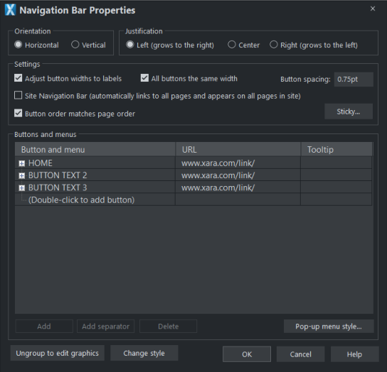
The upper half of the dialog allows you to set various properties of the NavBar, see below. The lower half allows you to add and remove buttons and menus and to edit the labels and links of each button and menu entry (see Buttons & Menus for more details).
Orientation
Choose whether you want your NavBar to be horizontal or vertical. For vertical NavBars you will normally want to make all buttons the same width (the width of the widest button), so you get a rectangular bar. See the "Adjust all buttons to widest label" option below, which controls this.
Justification
Choose how you want your bar to behave when its length changes as you edit labels and add/remove buttons. A left justified horizontal bar will grow to the right as you add more buttons or make the button labels longer. And the left edge of the bar stays in the same place on the page. Similarly a right justified bar keeps its right edge in the same place and grows to the left. And a center justified bar grows to left and right equally. Choose the centered option if, for example, you want a horizontal NavBar centered at the top of your page.
Adjust button widths to labels
Turn this option on if you want your buttons to be stretchy, so they grow and shrink as required to fit in the label text applied to the button. With this option off, your buttons will remain the same size and so a label that's too long for the button will extend beyond the edges of the button.
All buttons the same width
This option is enabled only if the above 'Adjust button widths to labels' option is on.
Select this option to make all your buttons the width of the widest button in the bar. For vertical NavBars this is almost always desirable so that you get a rectangular bar. For horizontal bars it often makes the bar look neater with each button the same size, but it requires more space and so you may not be able to fit as many buttons into your bar with this option turned on.
Button spacing
Here you can choose to have some space between each button in your horizontal NavBar, if you don't want each button to sit right up against its neighbor. Simply enter the number of pixels of space you would like and see the result on the canvas immediately.
Button order matches page order
Turning this option on makes the NavBar button order match the the page order in the document. If you re-order pages in the Page and Layer Gallery this also results in the NavBar being similarly re-ordered. This is mainly useful for NavBars in presentation websites, where the linear ordering of the pages is important and you want the buttons in your bar to be in the same order as the pages in your presentation.
Sticky
This enables you to stick your NavBar to the top of the page, so it is always in view when your visitor scrolls down. It opens the Sticky Objects dialog.
Copyright © Xara